
In today’s digital world, accessibility is essential. Yet, it is still too often treated as an afterthought, addressed only after the visual design and technical solutions are already in place. This approach is inefficient, expensive, and risky, because it requires teams to rework foundational decisions rather than designing and building in ways that are inclusive from the beginning.
There is a better way.
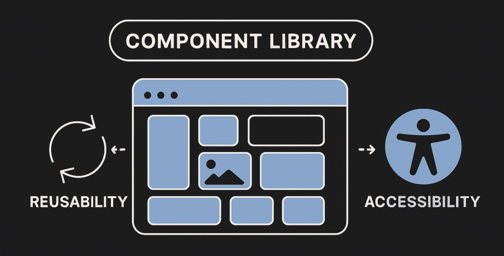
Reusable accessible components
When accessibility is built directly into your design system or component library, inclusion becomes part of your product’s identity rather than a checklist item. Each component, such as buttons, form fields, menus, dialogs, and interactive widgets, carries the correct semantics, keyboard behavior, focus management, and assistive-technology support by default.
Instead of solving the same problems for every new feature, teams can rely on a shared set of well-tested, accessible building blocks. This creates several benefits:
- Consistency: Users experience predictable and familiar interactions across the product.
- Efficiency: Designers and developers work faster by assembling features from reliable components instead of “reinventing the wheel”.
- Quality: Centralized components make it easier to audit, update, and improve accessibility across the entire system.
- Scalability: As the product grows, accessible components ensure that new features inherit the right behaviors automatically.
Accessibility as a continuous practice
Embedding accessibility in reusable components does not remove the need for thoughtful design, clear content, and thorough testing. It does however shift the baseline. Instead of starting from zero, teams begin with an accessible foundation. This raises the overall quality of the product and allows teams to focus on more nuanced user needs rather than the basics and achieving minimal compliance.
When accessibility is woven into the system itself, every new interface built with it becomes stronger, and every user benefits.
Your own component library, or an existing one
You can choose to create your own accessible component library or adopt an existing one.
Building your own from scratch allows you to freely define patterns that match your product’s needs, visual identity, and interaction models, but it requires dedicated expertise to ensure each component meets accessibility standards.
Using an established library, on the other hand, provides a solid foundation of pre-tested, accessible components that you can extend or customize. Both approaches give teams a consistent set of building blocks, helping them deliver inclusive experiences more efficiently and with greater confidence.
Building your own component library
You can choose to do everything from scratch, or use a tool which lets you focus on the components themselves rather than the surrounding application. Storybook is an example of a tool which gives you what you need to develop, test, and showcase each component in isolation, ensuring that design, functionality, and accessibility are consistent before integration.
Open source component libraries
Here are a few examples of open source component libraries:
Keep it to yourself or share with the world
Beyond general-purpose libraries, a growing number of public agencies and companies are releasing their design systems and component libraries as open source. I find this very interesting, and a few examples from Sweden are:
Even more examples of publicly published design systems can be found here: Design Systems Directory.
The post image is a conceptual image of a component library generated by Copilot AI.
Leave a Reply