
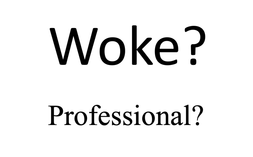
Under the Biden administration, the U.S. State Department changed its font choice for official documents, replacing the long-standing Times New Roman with Calibri in an effort to improve readability and accessibility. The change has recently been criticized as “wasteful” and “woke” by Secretary of State Marco Rubio, who has ordered a return to Times New Roman which according to him is “more formal and professional”. This decision aligns with the current administration’s effort to roll back diversity, equity, and inclusion (DEI) initiatives adopted by its predecessor.
BBC: Rubio orders return to Times New Roman font over ‘wasteful’ Calibri
This may seem like a small detail, but switching back to Times New Roman actually reduces accessibility. While some may prefer its “professional” look, Times New Roman was designed nearly 100 years ago for print. Calibri, in contrast, is a modern font created for readability on both screens and in print. Studies show that fonts like Calibri improve reading speed, reduce eye strain, and make text easier to understand. This is true for everyone, but matters even more to people with dyslexia, visual impairments or attention difficulties.
The difference in legibility is not a matter of opinion but a proven fact.
Choosing a font optimized for all media makes documents more readable and inclusive for everyone. It’s equally crucial as using clear and straightforward language. Together, thoughtful font choice and plain language ensure that your content is readable, inclusive, and effective.
Read more on accessible language in the post Writing accessible texts.
Leave a Reply to Weekly Reading List December 22 2025 – OZeWAI Cancel reply