
Accessible visual design is about more than aesthetics; it’s about ensuring that everyone, including people with visual impairments, can perceive, understand, and interact with digital content. From color choices to typography and interactive elements, visual decisions directly impact usability and inclusion.
In this article, we’ll explore accessible visual design through the lens of the Web Content Accessibility Guidelines (WCAG) 2.2. Although WCAG itself is not legislation, it represents the current best-practice standard for accessibility. A new version, WCAG 2.2, was published in October 2023, and working toward conformance with its applicable standards is now widely recommended.
Understanding WCAG Conformance Levels
WCAG guidelines are organized into three levels of conformance, each representing a different degree of accessibility:
- Level A – Minimum accessibility
Addresses the most basic barriers that prevent users from accessing content. - Level AA – More accessible
Builds on Level A and addresses the most common accessibility issues. This is the level most frequently referenced in legal requirements and organizational accessibility policies. - Level AAA – Even more accessible
The highest and most rigorous level of conformance
In practice, Level AA is the most common and realistic target for websites and digital products.
Accessible Color
Color is foundational to both visual design and accessibility. While color can communicate hierarchy, emotion, and brand identity, it can also create barriers if not used thoughtfully.
What Is Color Contrast?
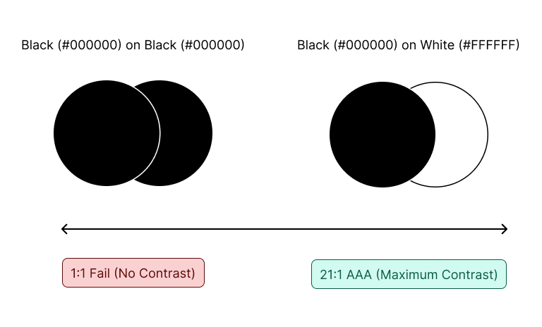
Color contrast measures the perceived difference between a foreground color (such as text or icons) and a background color. Adequate contrast ensures content remains readable for users with low vision, color vision deficiencies, or those viewing content in challenging environments.
Contrast is measured as a ratio, ranging from:
- 1:1 – No contrast (for example, black text on a black background)
- 21:1 – Maximum contrast (black text on a white background)
WCAG 2.2 Color Contrast Requirements
To meet WCAG 2.2 Level AA, contrast must meet the following thresholds:
Text
- Normal text (less than 18pt regular or 14pt bold): 4.5:1
- Large text (18pt or larger, or 14pt bold or larger): 3:1
Non-text elements
- UI components (buttons, form fields, focus indicators, link underlines): 3:1
- Informational graphics (charts, graphs, icons conveying meaning): 3:1
Poor color contrast is one of the most common accessibility failures—and one of the easiest to fix.
Accessible Typography
Accessible typography is at the core of accessible visual design. Choices around font, size, weight, spacing, and line length all affect readability and usability.
Font Choice and Legibility
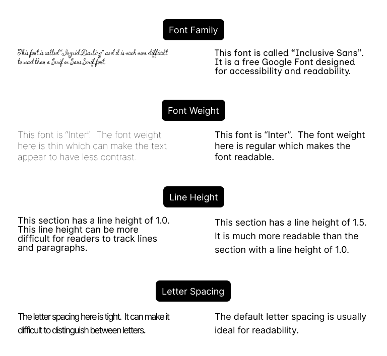
Fonts should have clear, distinguishable letterforms. Decorative fonts can hinder legibility and should be used sparingly and for stylistic purposes only. For body text, legible serif or sans serif fonts are the best choice.
Font Size and Weight
A widely accepted best practice is to use 16px as the base font size for body copy. Font weight also plays a critical role in readability:
- Very thin font weights can appear faint and reduce perceived contrast
- Bold text at very small sizes can also reduce legibility
Typography should balance size and weight to ensure clarity without visual strain.
Line Height (Leading)
Line height refers to the vertical spacing between lines of text. A line-height ratio of 1.5–2 times the font size is a strong starting point. Adequate spacing helps users track lines and paragraphs more easily.
However, too much spacing can also be problematic, interrupting reading flow and making it harder to determine which lines belong together.
Letter Spacing (Tracking)
Letter spacing controls the horizontal space between characters:
- Spacing that is too tight makes it difficult to distinguish letters
- Spacing that is too wide can make it hard to identify word boundaries
Most typefaces are designed with default letter spacing that works well for most users, so adjustments should be made cautiously.
Line Length
Line length refers to the number of characters in a line of text before wrapping. The optimal range is 45–75 characters per line.
- Lines that are too short increase eye movement and fatigue
- Lines that are too long make it harder to track from the end of one line to the beginning of the next
Accessible Iconography
Icons enhance usability by supporting text, saving space, and allowing users to scan content quickly. However, they also introduce accessibility challenges because they rely on visual recognition and shared understanding.
Best Practices for Icon Use
- Follow common patterns so users can easily understand meaning
(e.g., a house icon for “Home” or a hamburger menu for navigation) - Pair icons with text labels when meaning may not be universally understood (for example, using “Menu” alongside a hamburger icon)
Icon Accessibility Guidelines
- Icons should meet color contrast requirements of at least 4.5:1
- Recommended icon size: 24×24px
- Minimum touch target: 44×44px
Icons should never be the sole means of conveying critical information without additional context.
Accessible Tap and Touch Targets
Tap or touch targets refer to the interactive surface area of an element, including padding around it. Larger targets improve usability for users with limited fine motor control, tremors, or larger hands.
- Minimum recommended tap target size: 44×44px
These requirements generally apply to buttons and controls, but do not apply to inline elements, such as text links within a sentence, where line-height constraints limit expansion.
Accessible Interactive States
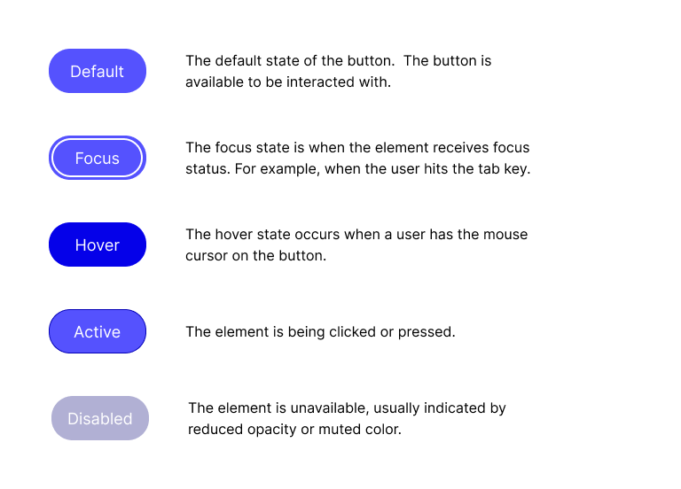
Interactive states, often called micro-interactions, communicate how and when elements can be interacted with.
Common Interactive States
- Default: The element’s normal appearance
- Hover: Visual feedback when a pointer hovers over an element
- Active: Appearance when the element is being clicked or pressed
- Focus: When an element receives keyboard or assistive technology focus (for example, via the Tab key)
Focus states are crucial for accessibility and should be clearly visible, often using an outline or focus ring. The contrast of focus indicators should be at least 3:1.
Hover and active states do not have strict accessibility requirements, but if used, they should be visually distinct.
Disabled States
Disabled elements indicate that an action is currently unavailable. These elements are often styled with reduced opacity or muted colors and do not need to meet standard contrast requirements because they are inactive.
However, surrounding content must clearly explain why the control is disabled, ensuring users are not left confused or blocked without context.
Conclusion
Accessible visual design is the result of many intentional choices: color contrast, typography, icon usage, touch targets, and interactive states all play a role. While WCAG 2.2 is not legislation, it represents the current gold standard for accessibility best practices, with Level AA serving as the most common and achievable goal.
There is actually so much more to accessible visual design, including interactive states, responsive design, interaction patterns, and more! This post is just the start of learning accessibility in visual design.
Designing accessibly doesn’t limit creativity. Instead, it challenges designers to create work that is clearer, more usable, and more inclusive. When accessibility is considered from the beginning of the design process, everyone benefits.
Leave a Reply to Weekly Reading List January 19 2026 – OZeWAI Cancel reply