
As an avid board gamer, I often reflect on how much harder my hobby would be to pursue without functional vision. Recently, though, I’ve stumbled across several examples of inclusion that genuinely made me happy. One was hearing a blind colleague enthusiastically describe how much she enjoyed the braille edition of Sushi Go. In some games, simply adding braille to the cards is enough to open the experience to the blind.
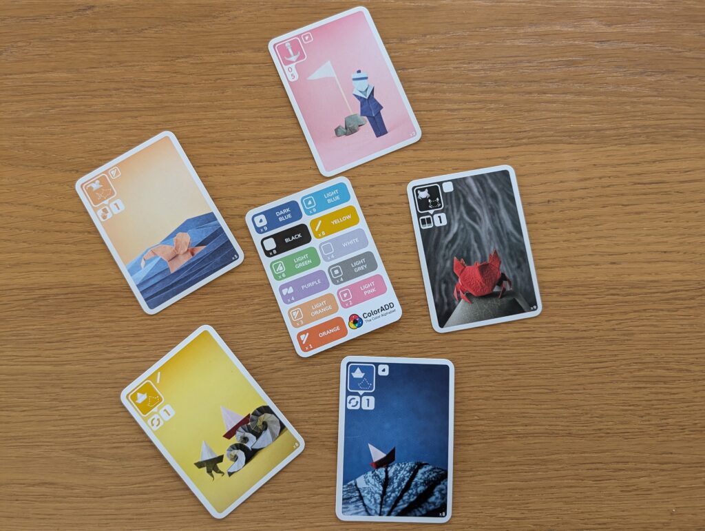
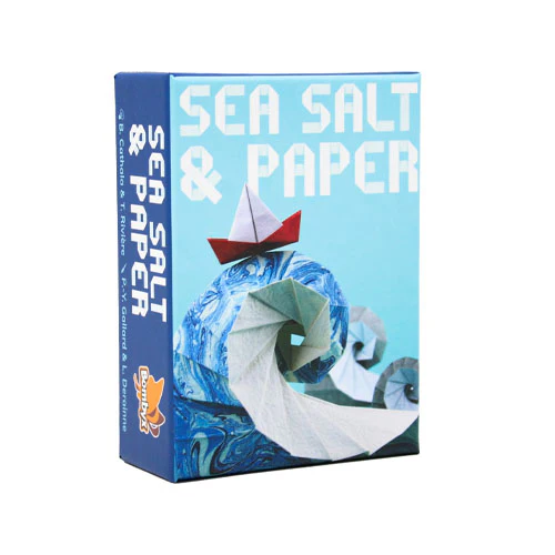
Board game adaptations for blind players could easily be a topic of its own, but this time I want to focus on something I discovered in a standard edition card game. When I first played Sea Salt & Paper, I noticed small symbols printed on the cards, along with a reference card explaining the ColorADD system. Sea Salt & Paper relies heavily on vision and the ability to recognize colors, but they have made an effort not to exclude colorblind players by including symbols to clarify the meaningful colors in the game.
ColorADD – The Color Alphabet
ColorADD was developed by Miguel Neiva, graphic designer and professor at the University of Minho in Portugal. Link to the ColorADD webpage: ColorADD – The Color Alphabet
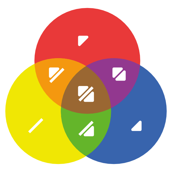
The clever thing about ColorADD is that it is built from a few very simple symbols that can be combined. The primary colors are represented by simple geometric marks: a diagonal line for yellow, an upward-pointing triangle for red, and a downward-pointing triangle for blue. Secondary colors are created by combining the symbols of their component colors.
For example:
- blue + yellow creates green
- red + yellow creates orange
- red + blue creates violet
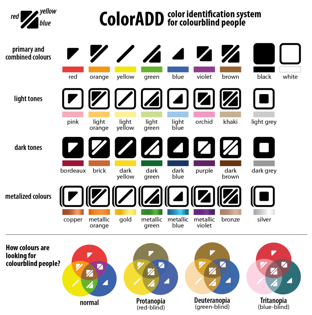
Black is represented by a filled square, and white by an outlined square. Dark and light tones of other colors are created by adding the black or white square as their background. Metallic colors can also be represented by adding what resembles a drop shadow.
The Venn diagram illustrates well how colors and their symbols combine:
Here is a more complete key, also showing light and dark tones and metalized colors, along with examples of how the colors may appear to people with some color vision impairments:
Real world color translation with apps
Another use for the ColorADD system is mobile apps that translate real-world colors into ColorADD symbols, helping colorblind users interpret situations where color bears important information:
ColorADD app for Android
ColorADD app for iPhone
Link to web accessibility requirements
When designing and developing websites, we learn to never use color as the only visual means of conveying information. Typically, the solution is to combine color with text, symbols or other visually distinguishable features.
WCAG 1.4.1 Use of Color: “Color is not used as the only visual means of conveying information, indicating an action, prompting a response, or distinguishing a visual element.”
ColorADD is another potential solution that could be used on the web as well, reinforcing the idea that color should never be the only means of conveying information, but part of a system where meaning is always accessible in more than one form.
Leave a Reply